Redesigning the Integrated Product, Employee, and Service Experience
This project was all about challenging business as usual. The big question we set out to answer was: “How can we meet the needs of UHC’s next-generation consumers in a way that engages, extends, and excites?”
I was brought in to design a connected experience across the full ecosystem, employee, service, and product, all layered into one complex, omnichannel journey. We uncovered what these next-gen consumers actually needed, then built out a new kind of service and employee experience to match.
Deeply Cross-Functional
This wasn’t a solo effort. The work was hands-on, messy in the best way, and driven by real collaboration. We brought together people from service design, UX, research, analytics, engineering, product, strategy, and operations. That level of diversity pushed the work further and made it more real.
Designing Across Physical, Digital, and Human Touchpoints
The journeys we were designing didn’t sit in one channel. People moved between websites, phone calls, mail, in-person interactions, apps, and internal handoffs. Sometimes all of that happened in the same day. Designing across that kind of terrain meant switching constantly between high-level systems thinking and tactical execution. It demanded a flexible toolkit and tight alignment with the teams bringing it to life.
What the Project Aimed to Do
At its core, this work was about helping people better understand their insurance. We also questioned why UHC delivers education the way it does in the first place. Alongside that, we shaped key parts of the employee experience to support the bigger service ecosystem.
One of the most meaningful outcomes was a human-centered narrative that could actually resonate. It helped connect the dots across business units and gave the project a shared emotional hook that moved people to act.
Tools & Methods
Experience & Service Design
Service design
Employee experience design
Systems thinking
Journey maps
Experience maps (current and future)
Service blueprints
Ecosystem maps
Stakeholder maps
Process design
Organizational change
Research & Insight
User research
Empathy maps
Customer archetypes
Employee archetypes
Business requirements
Concept testing
Facilitation & Strategy
Design workshops
Storytelling and storyboards
Key scenarios
Prioritization frameworks
Product strategy
Prototyping & Tools
Figma
Miro
Wireframes and mockups
Designing the Total Experience: Digital, Employee, and Physical
One of the biggest shifts in this project was helping stakeholders move beyond siloed thinking. Instead of treating service design, product design, or employee experience as separate efforts, we focused on building a unified view of the entire experience ecosystem. The goal was to connect the dots across digital, human, and physical touchpoints so the organization could design more cohesively and deliver value more effectively at every step.
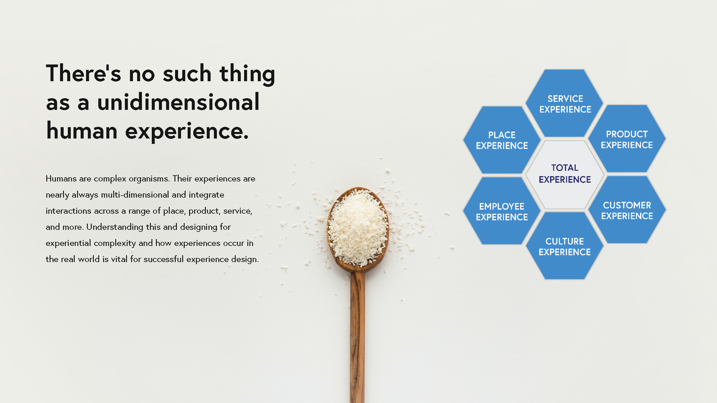
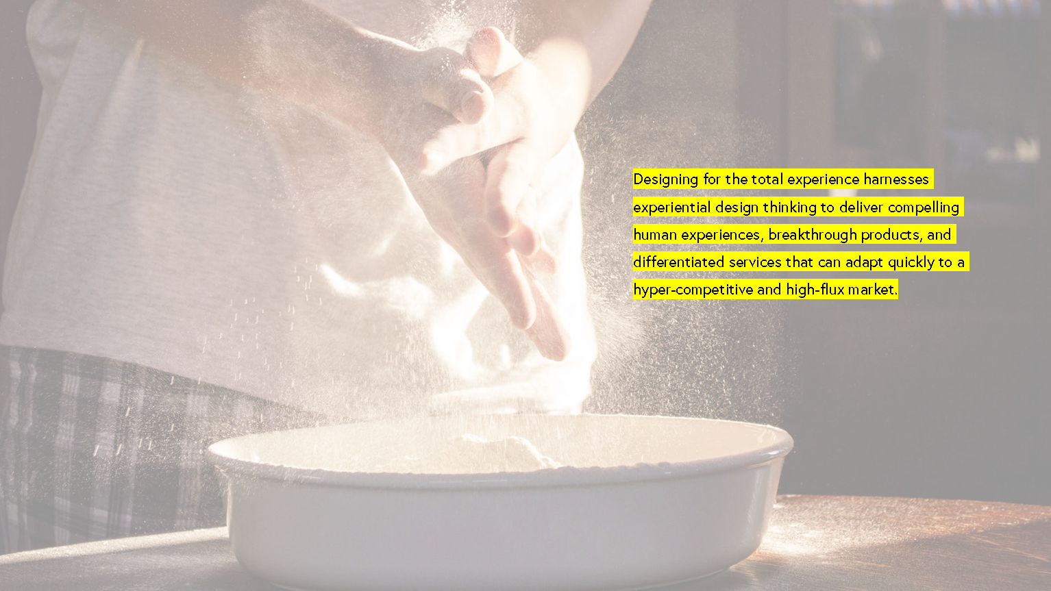
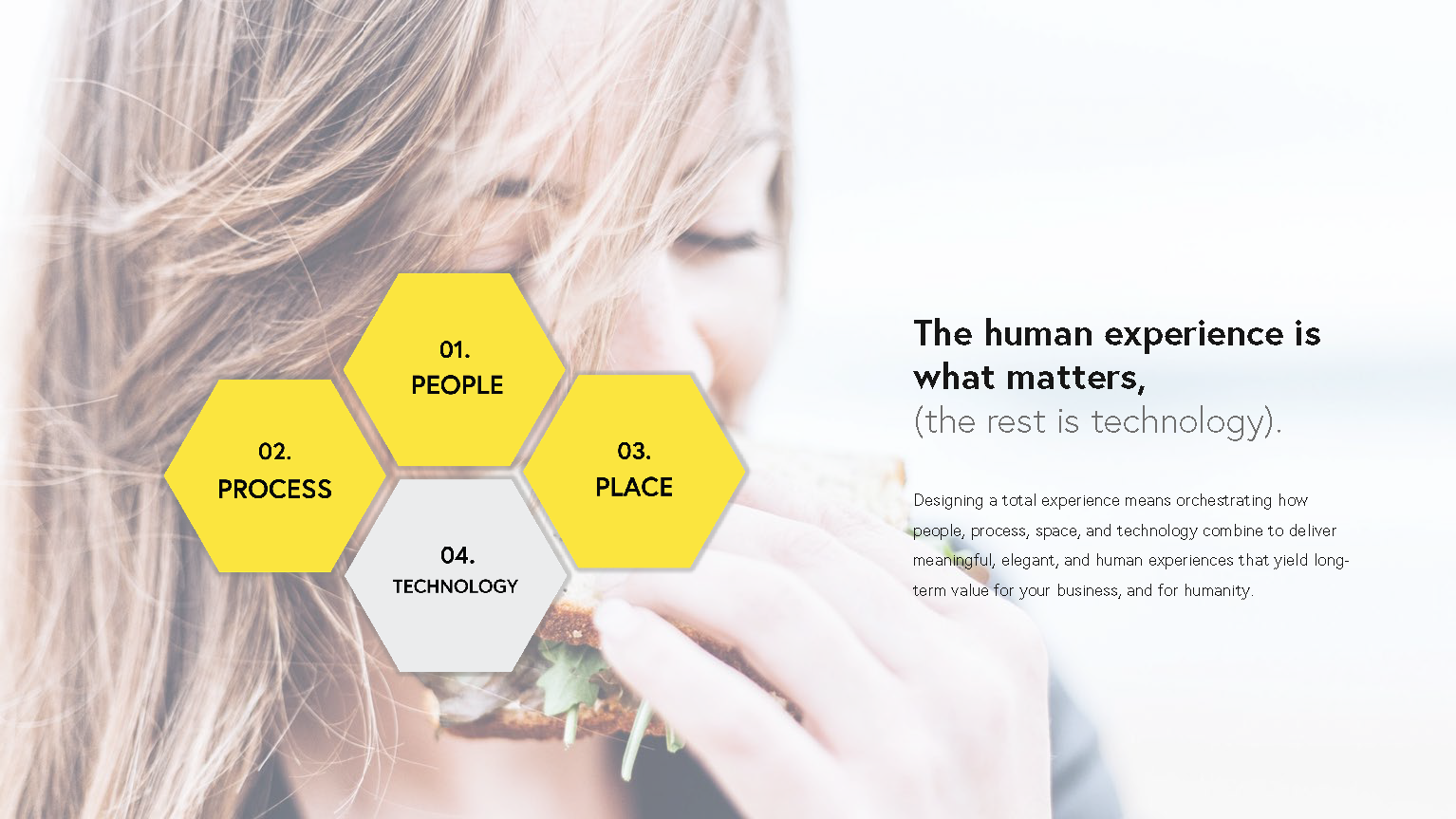
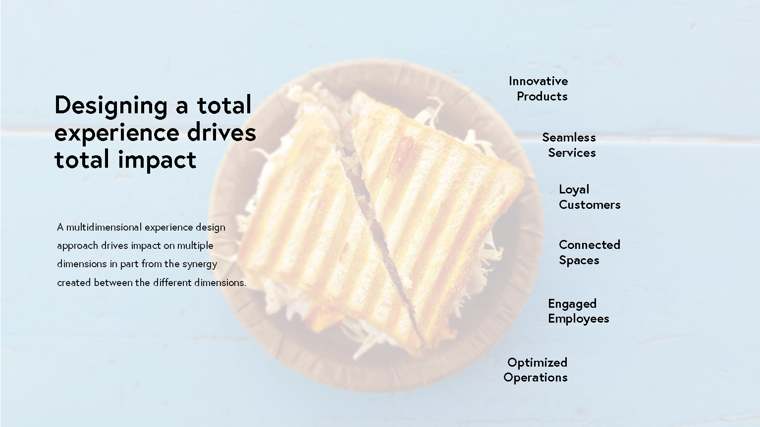
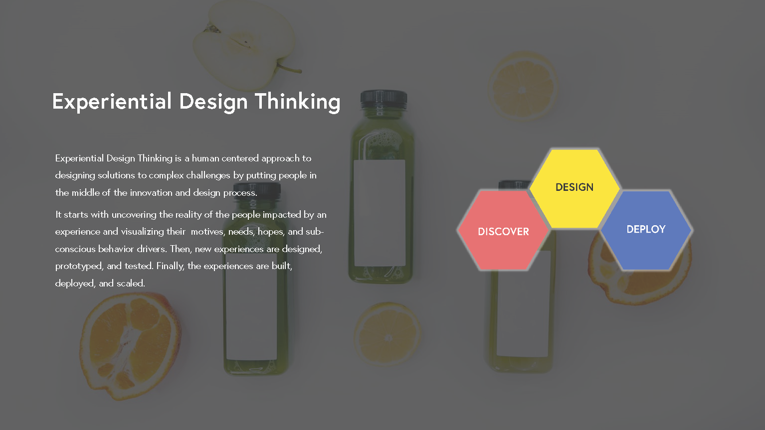
This is a point-of-view piece I created to help cross-functional teams think more holistically when designing omnichannel experiences. It frames why total experience design matters and how impact multiplies when product, service, and employee experience are aligned. I’ve used this in workshops, onboarding decks, and strategy sessions to shift mindsets and get teams focused on the full system, not just isolated touchpoints.
THE PROCESS
STAGE 1:
Challenge
What are the fundamental factors driving the expectations of the new consumer related to understanding their plan? What are the key employee experience challenges and opportunities?
Methods
Collaborative workshops; uncover customer and employee jobs, pains, and gains, analyzed for themes, and prioritized areas for action
Artifacts
Project plan, Jobs-Pains-Gains with prioritized themes

Tool: Jobs-Pains-Gains
This tool helped our team quickly map out the core needs, frustrations, and opportunities across both customer and employee experiences. By visualizing what people are trying to get done (jobs), what they value (gains), and where they’re struggling (pains), we were able to surface actionable insights and prioritize areas for improvement. The vertical axis let us stack inputs by impact, helping us zoom in on what really matters instead of chasing noise. This became a foundational layer for the service blueprint and experience map that followed.
Stage Two: Mapping the Real Experience
Challenge
What does the current experience actually feel like, for both consumers and employees? How do people think, feel, and act as they move through key touchpoints? Where are the physical moments that carry the most weight? And which specific interactions make or break the overall outcome?
Methods
We ran collaborative workshops and used tools like key scenarios, experience graphs, service blueprints, and experience maps to unpack the journey. We focused especially on identifying “moments that matter” across the ecosystem.
Artifacts
A full experience map that includes visual summary graphs and a prioritized set of critical moments that most influence outcomes.
Tool: Experience Scenario Map
This tool was used to visualize a specific end-to-end scenario from the perspective of a real individual, in this case, someone seeking help for their mental health. We combined emotional journey lines with structured rows covering environment, actions, questions, and service layers. This helped the team pinpoint how people actually move through the experience, where they hesitate or drop off, and what interventions could make a meaningful difference.
It allowed us to connect the dots across systems, identify emotional highs and lows, and bring clarity to how services show up (or fall short) across different stages of the journey. Most importantly, it gave decision-makers a visceral understanding of what the real experience feels like.
STAGE 3: Identify and Prioritize Opportunity Areas
Challenge
How might we identify ideas that truly reflect what today’s consumers want and need as they learn about and engage with their health plan? At this stage, we needed to generate and organize a wide range of concepts, then prioritize which ones to pursue based on real user value and feasibility within the business.
Methods
We brought together research and strategy in a co-creative environment. Workshops helped us synthesize insights, while desk and secondary research added context. Using guided facilitation, we co-ideated around emerging needs and expectations, then applied prioritization techniques to surface high-impact opportunities.
Artifacts
We created a research wall to synthesize key findings and insights from earlier stages, and developed a Value vs. Effort Matrix to map ideas according to what matters most to consumers and what’s achievable by the business. This helped focus decision-making and provided a shared reference point for the next phase of design.

Tool: Value to Effort Matrix
This tool helped us sort and prioritize ideas by mapping them on a grid of value to the consumer versus effort to execute. It visualized the tradeoffs, surfaced high-potential quick wins, and clearly flagged which ideas might be worth the heavier lift.
We used sticky notes to cluster insights from research and co-ideation sessions. Placing them on the matrix allowed us to collaboratively debate impact and feasibility with stakeholders in real time. It also provided a tangible way to anchor planning conversations, everyone could see which ideas rose to the top and why.
STAGE 4: Visualize the Future Experience
Challenge
What should the ideal future plan education experience feel like for customers and employees? We needed to translate all the prior insights: jobs, pains, gains, and key moments into a clear and compelling future-state journey that inspires alignment and action.
Methods
We used collaborative workshops and storyboarding to imagine Marah’s preferred experience from start to finish. We translated critical insights into Key Scenarios and simple user stories to help stakeholders see how each moment could be improved. This helped ensure that both customer and employee needs were addressed in a way that felt cohesive and real.
Artifacts
The output included a fully illustrated storyboard and a supporting set of Key Scenarios. These brought the future experience to life in a tangible way and highlighted the high-impact moments, needs, and opportunities that matter most.

Tool: Storyboard + Key Scenarios
This tool helped us bring the future experience to life in a way that felt concrete, human, and actionable. By illustrating key moments in Marah’s ideal journey, we could align stakeholders around a shared vision without relying on abstract strategy language. The storyboard allowed us to map emotional highs and lows, clarify specific interactions, and show how improved touchpoints could create a more seamless and supportive experience. The Key Scenarios provided supporting detail, helping cross-functional teams see how jobs, gains, pains, and priorities played out across channels and roles.
It became a central reference for making decisions across product, policy, service design, and employee enablement.
Adjacent Layer: UX Design
This layer added strategic value by translating future-state journeys into tangible digital experiences. This bridged the gap between conceptual strategy and testable interactions, helping stakeholders visualize what success could look like in action.
Challenge
How might the reimagined experience actually function at the digital touchpoint level? What does it feel like to move through the redesigned flow as a real user?
Methods
Collaborative workshops, scenario modeling, wireframing, clickable prototypes, early user testing
Artifacts
User journey-based wireframes, interaction prototypes, and a focused user testing plan that captured early feedback on content, flow, and usability

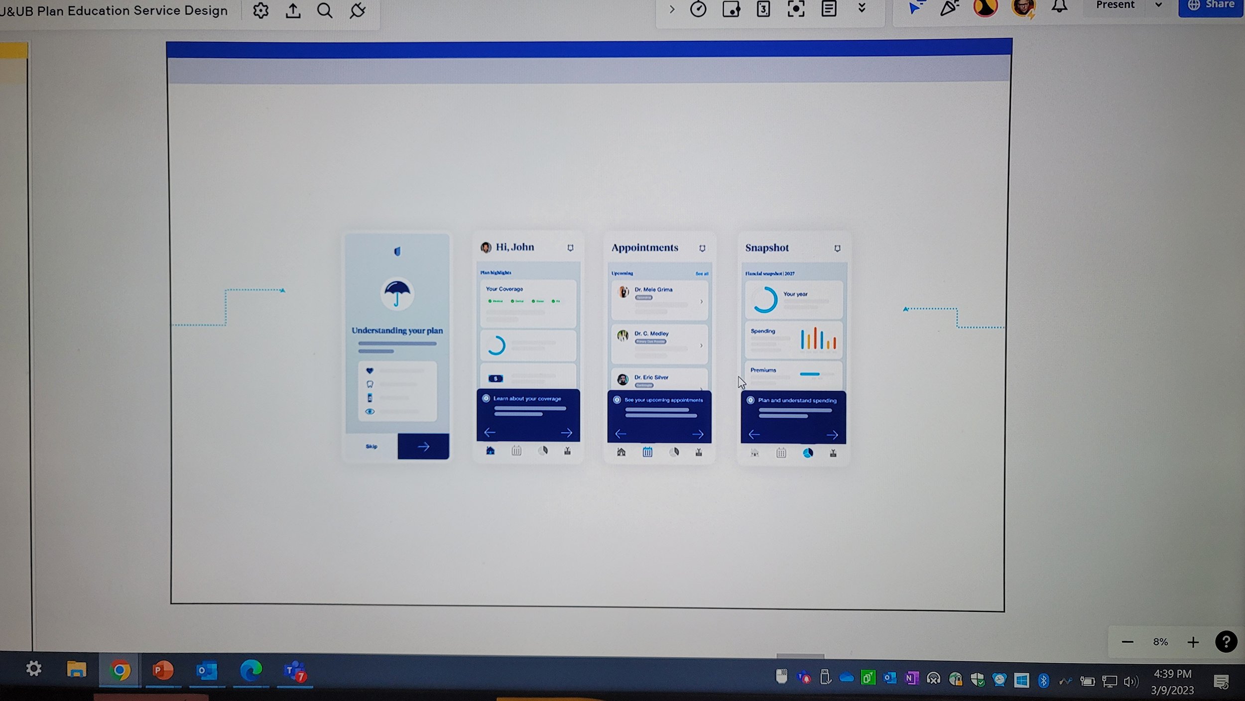
This prototype brought the reimagined plan education journey to life in a tangible, testable way. Grounded in key scenarios and user stories from earlier service design stages, it translated abstract experience principles into a clickable interface that simulated real user flows. The screens pictured here focused on helping users understand their coverage, navigate care, and make informed financial decisions about their health plan.
The goal wasn’t just to build wireframes, it was to validate whether the redesigned experience could actually deliver clarity, reduce drop-off, and create a sense of agency. The prototype helped surface usability questions early and gave stakeholders a shared, visual reference point to accelerate alignment across design, product, and policy.
Reflection
This project wasn’t just about improving a service. It was about making space for a different kind of conversation, one that acknowledged the emotional weight and complexity of navigating healthcare as both a consumer and an employee.
What stood out most was the depth of empathy required to design meaningfully at this scale. Creating better experiences meant listening not only for pain points, but for hopes, frustrations, and unspoken fears. It meant designing across silos, shifting internal mindsets, and helping teams align around the idea that clarity, care, and dignity are not features, they are fundamentals.
The real success of this work wasn’t a single deliverable. It was the shift in how teams saw the people they were designing for, and what became possible once that shift happened.
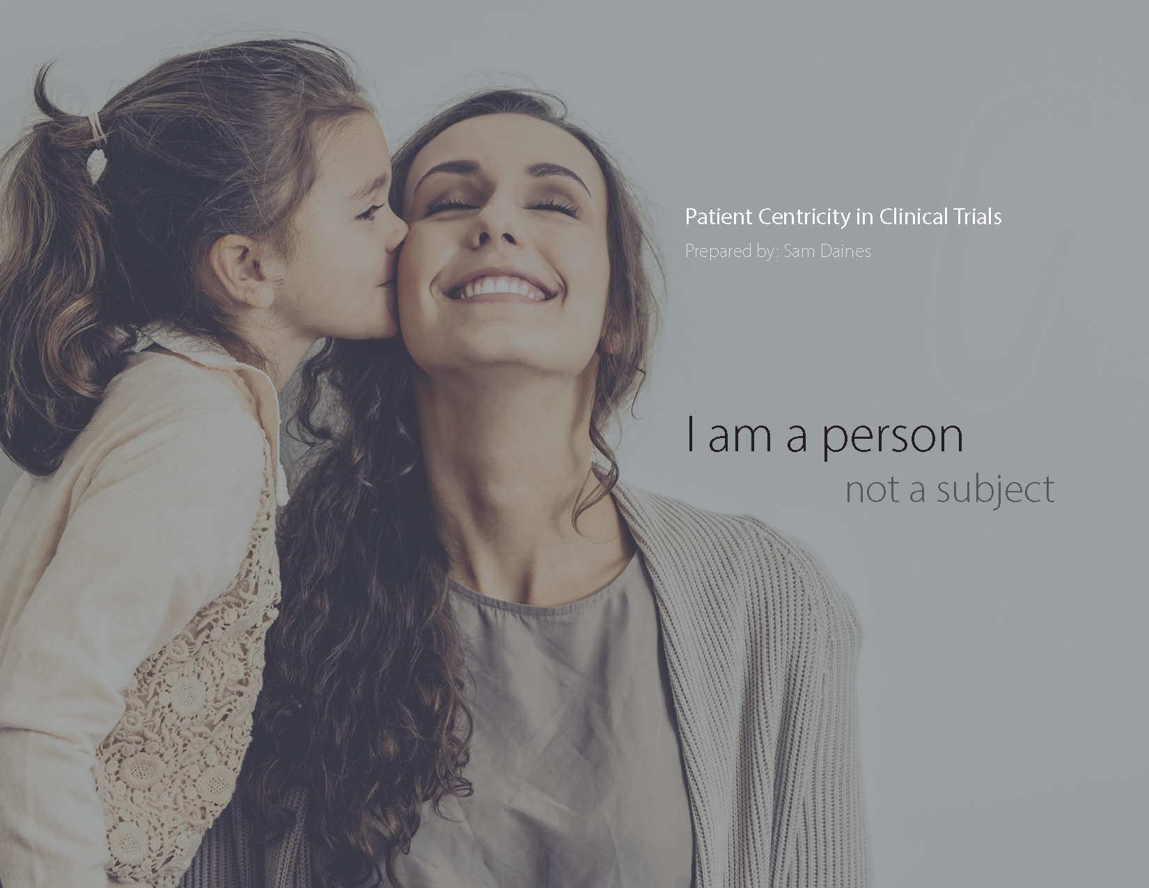
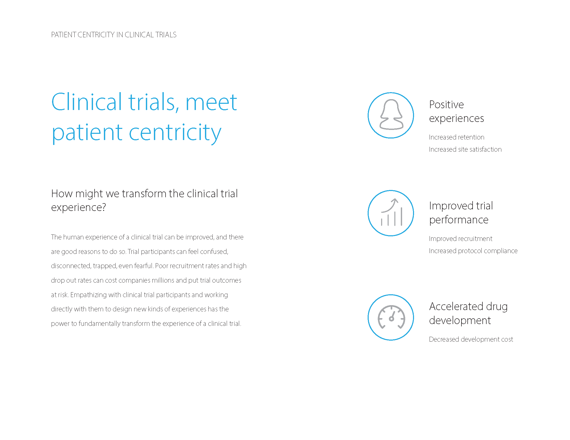
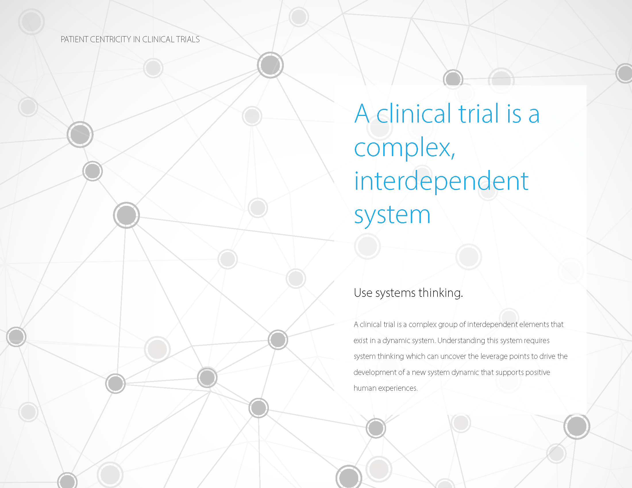
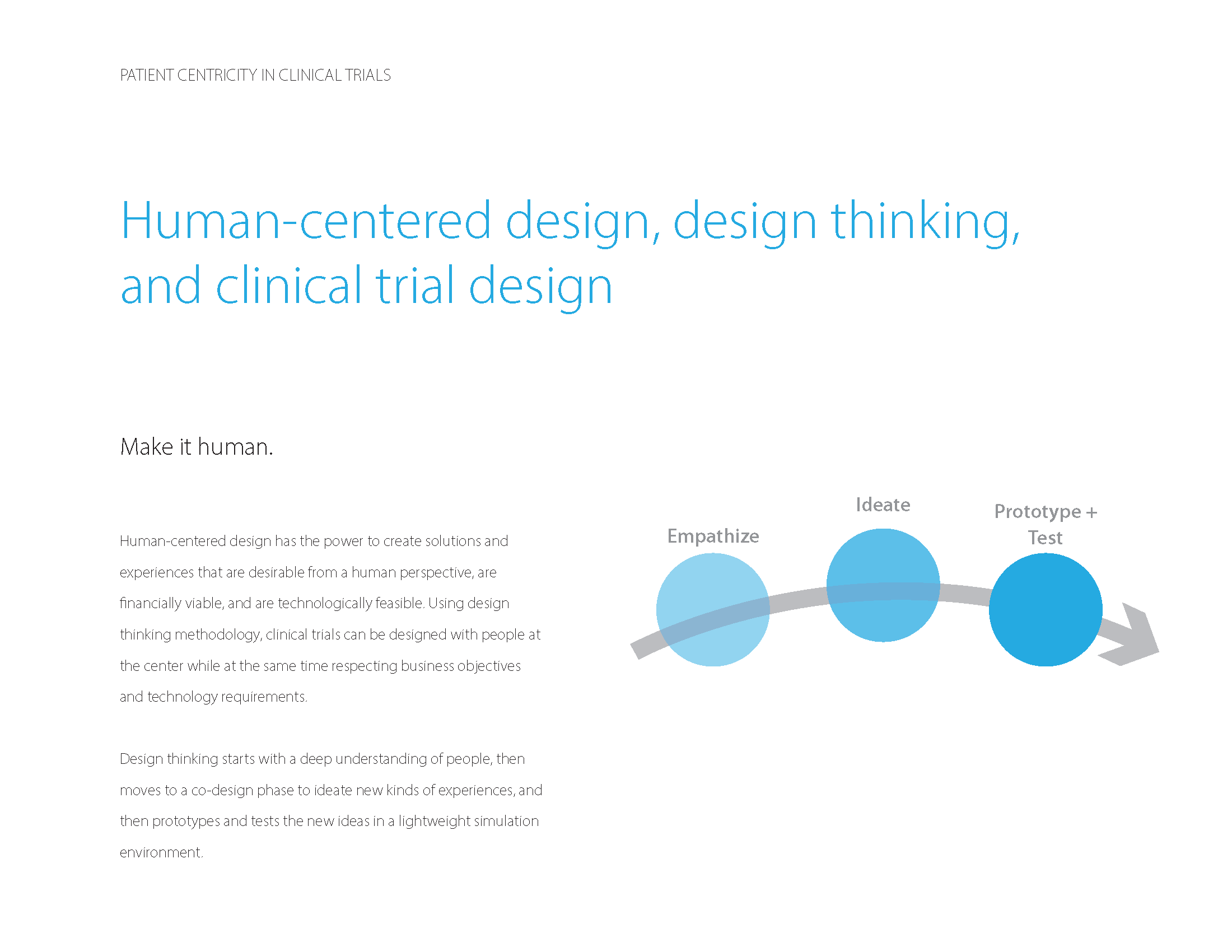
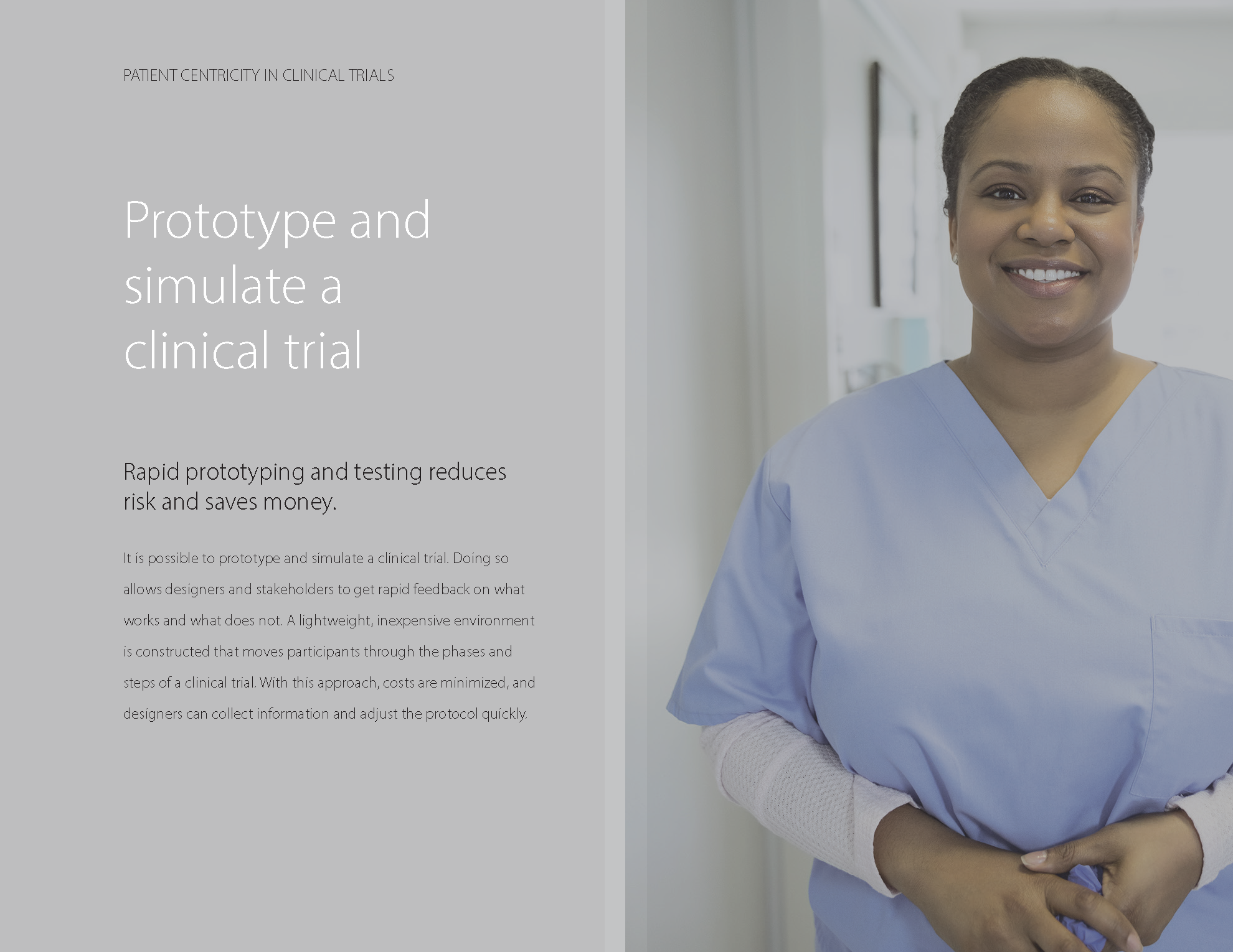
Vision Piece: Centering the Patient in Clinical Trials
This wasn’t a project in the traditional sense, but a positioning piece I created to reframe how clinical trials could be designed around real human experience. It was intended to provoke conversation and shift internal mindsets within a large pharmaceutical organization, from viewing participants as data sources to recognizing them as people with needs, fears, and motivations. The goal was to inspire teams to rethink study design with empathy, dignity, and patient engagement at the center.